
 |
Art Principles of Art/Design Contrast
Laura Anderson Barbata |
Site Map | Color - Element of Art/Design | Balance - Principle of Art/Design | Rhythm/Pattern - Principle of Art/Design | Emphasis - Principle of Art/Design | Andy Goldsworthy - Elements of Art/Design | Historical and Cultural Context | Quotes | Glossary | Graphic Organizers | Rules of Thumb | Co-Teachers - Doug and Melissa | Gallery
E-Mail Doug at mrdoug@aznet.net
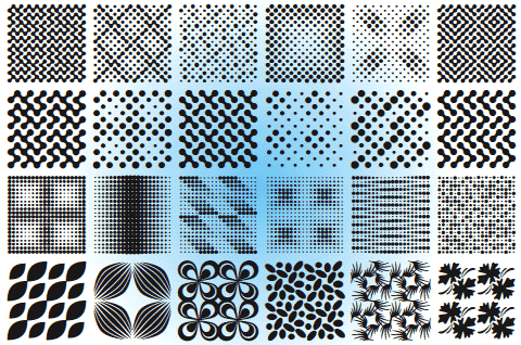
Pattern | Edge | Value | Intensity | Temperature | Texture | Size | Shape
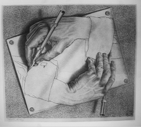
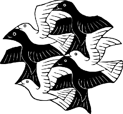
MC Escher
Isn't it fascinating to realize that no image, no form, not even a shade or color, 'exists' on its own; that among everything that's visually observable we can refer only to relationships and to contrasts?
Maurits Cornelius Escher (1898-1972), Dutch graphic artist.
Contrast
1. to compare in order to show unlikeness or differences; note the opposite natures, purposes, etc., 2. to exhibit unlikeness on comparison with something else; form a contrast. 5. a striking exhibition of unlikeness. 7. opposition or juxtaposition of different forms, lines, or colors in a work of art to intensify each element's properties and produce a more dynamic expressiveness. 8. Photog. the relative difference between light and dark areas of a print or negative. (Webster's Encyclopedic Unabridged Dictionary of the English Language, Thunder Bay Press, San Diego, CA 2001, p. 442)
The point, by providing contrast you direct the viewer to certain objects, elements, or areas. You can tell a story or make a point. You can create a road map for the viewer to follow. You can use contrast to influence or persuade. Contrast becomes a powerful tool when creating works intended to captivate a viewer, intellectually, physically, or emotionally.
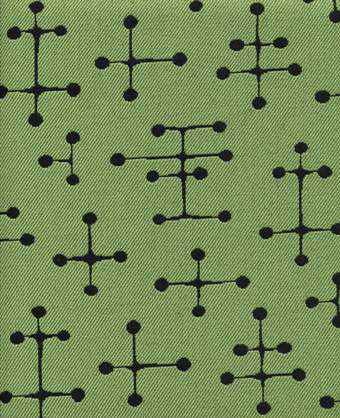
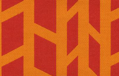
1. a decorative design, as for wallpaper, china, textile fabrics, etc. 2. decoration or ornament having such a design. 3. a natural or chance marking, configuration, or design. 4. a distinctive style, model, or form. 5. a combination of qualities, acts, tendencies, forming a consistent or characteristic arrangement. (Webster's Encyclopedic Unabridged Dictionary of the English Language, Thunder Bay Press, San Diego, CA 2001, p 1423)
M C Esher
Ray Eames
Camille Graeser
Zuzana Licko
Using hard, soft, or blurred edges can define objects or areas as closer vs further away, the focal point vs the contextual surroundings, or a main subject vs subordinate or support subjects, etc.
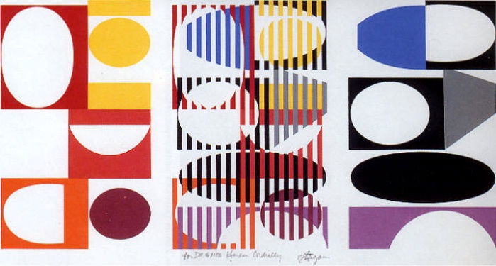
Yaakov Agam
Paula Scher
Jessica Helfand
Doug Kipperman
Value refers to the lightness and darkness of a color. For example, if light falls on a green ball the part of the ball nearest the light will be lightest in value because it reflects the most light. The part of the ball opposite the light will be the deepest in the shadow and thus darkest in value.
Remember - you can also change the value of a color by adding black (shade), or white (tint), or gray (tone). As white is added to a color it becomes "higher" in value (lighter). As black is added it becomes "lower" in value (darker).
Use values that are close together to give the design a calm appearance.
Use values of pure hues as well as those of tints and shades to create movement.
Use value contrasts to show texture and as an effective means of directing viewer attention in a composition.
Remember that value is the relationship of light to dark.
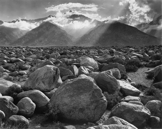
Ansel Adams
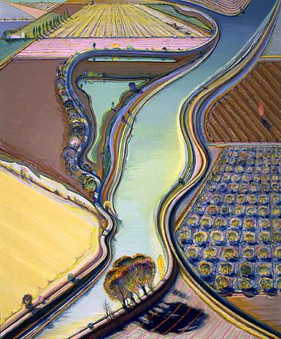
Wayne Thiebaud
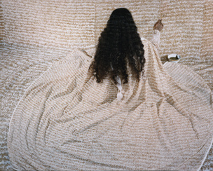
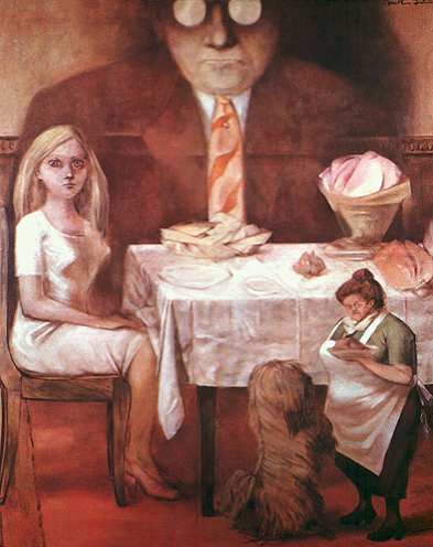
Laura Anderson Barbata - I am not worthy to receive you, but only say the word and my soul will be healed, 1996
The brightness or dullness of a color. A pure hue is a high-intensity color. A dulled hue, a color mixed with its complement is called a low-intensity color.
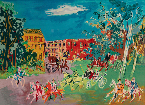
Jean Dufy
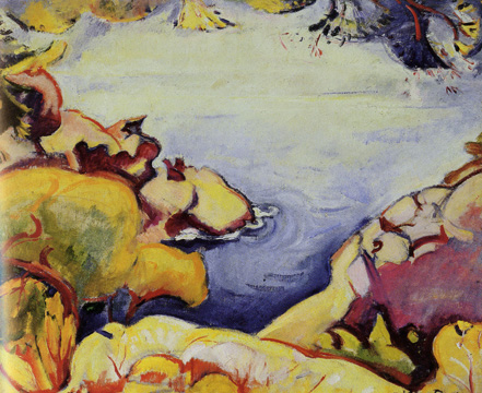
Emile Othon Friesz
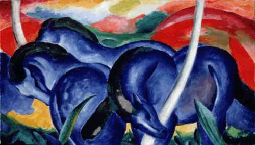
Franz Marc
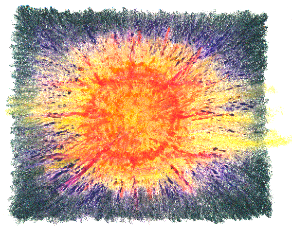
Use warm and cool colors to create a sense of "temperature" in either the physical or emotional realm.
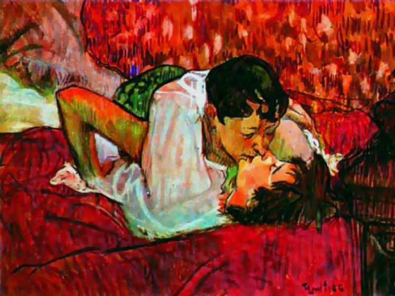
Henri Toulouse-Lautrec
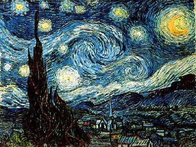
Vincent Van Gogh
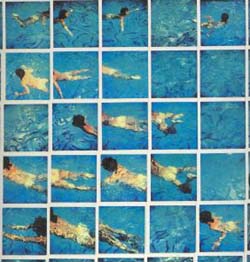
David Hockney
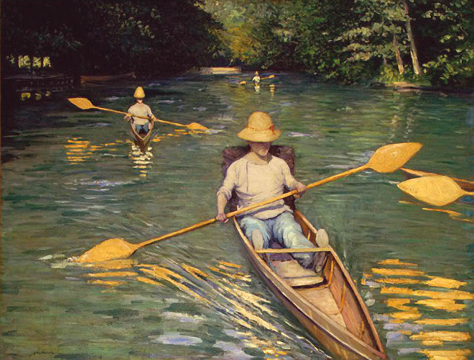
Gustave Caillebotte
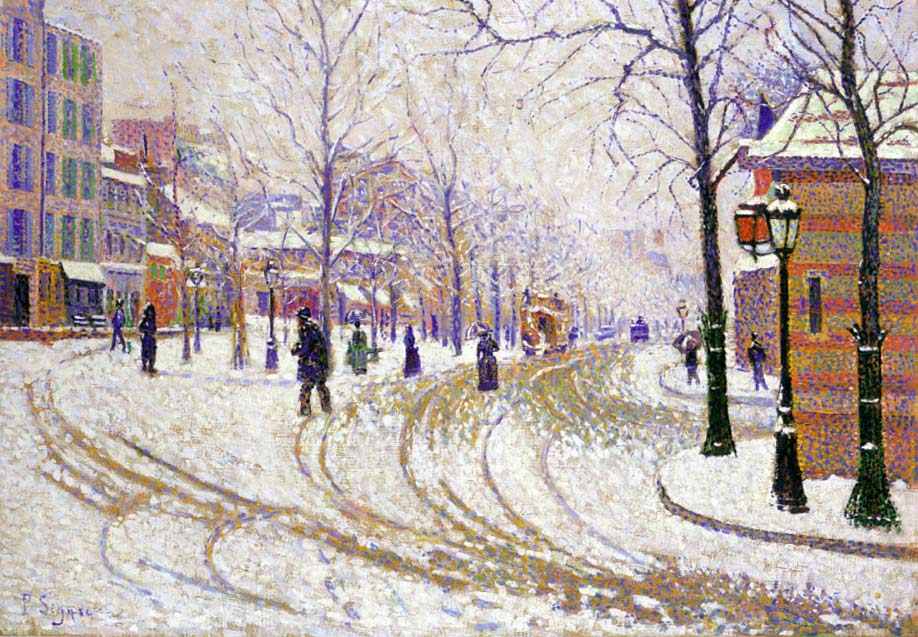
Paul Signac
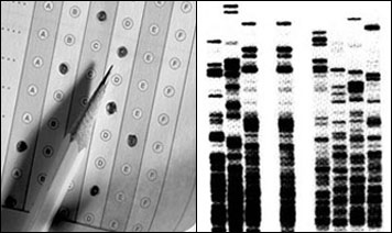
Texture provides contextual clues and can separate or distinguish areas of importance by providing more detail. Texture provides a physical and emotional component to a piece. We start to feel the surface of the work which gives us a sense of dimension and form.
Karyl Sisson
Wayne Thiebaud
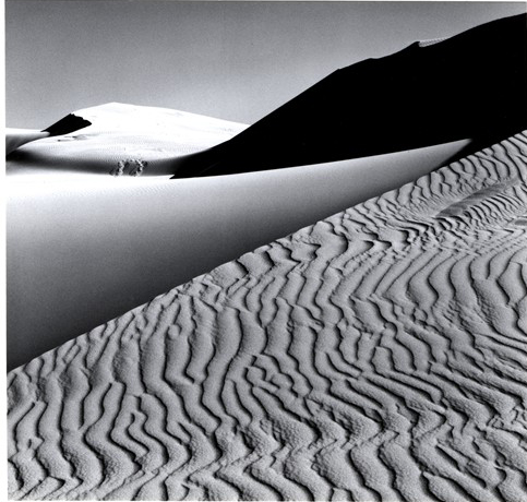
Ansel Adams
The size of one object or element relative to others within a composition provide the viewer with a sense of what is important. We normally use a larger element as the dominate focal point; however, using a smaller element can also show dominance or subordinance.
Lalla Essaydi
Dorothea Tanning
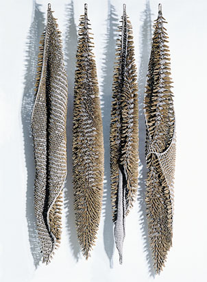
Laura Anderson Barbata
Louise Bourgeois
(noun) - A shape is an element of art. Specifically, it is an enclosed space, the boundaries of which are defined by other elements of art (i.e.: lines, colors, values, textures, etc.).
Shapes are limited to two dimensions: length and width. Geometric shapes - circles, rectangles, squares, triangles and so on - have the clear edges one achieves when using tools to create such shapes. Organic shapes have natural, less well-defined edges (think: an amoeba, or a cloud). (http://arthistory.about.com/cs/glossaries/g/s_shape.htm)
The shape of objects provide information. Shapes give representational clues and meaning. Shapes can bring order or chaos to a composition. Shapes can imply an attitude, an emotion, a context. We use the square shape to define something, someone who gives the impression of having straight edges, 90° corners, and is well contained. We use squares to suggest an element might have the following characteristics: strong, solid, steady, immoveable, literal, conservative, uptight, etc. Although a square shape has a similar geometric use of straight lines and well defined corners as a rhomboid or trapezoid, the square lacks the same movement or energy. Comparing a square to a circle, both geometric, the circle represents continuity, harmony, potential movement, wholeness. Organic shapes offer an opportunity to express less concrete, tangible, solid imagery. Using different shapes together, geometric and organic, also provides information about the relationships within the piece. Watch out for the sharp triangle, you could poke an eye out.
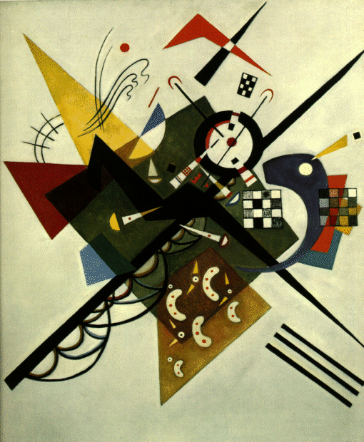
Wassily Kandinsky
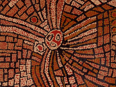
Naata Nungurrayi
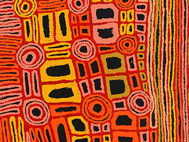
Pantjia Nungurrayi
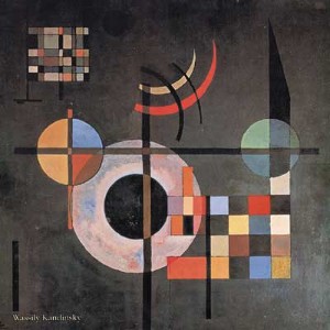
Wassily Kandisky
|
|
Melissa and I would like to |