
 |
Art Principles of Art/Design Emphasis
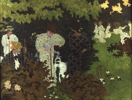
Pierre Bonnard - The Croquet Game |
Site Map | Color - Element of Art/Design | Balance - Principle of Art/Design | Rhythm/Pattern - Principle of Art/Design | Andy Goldsworthy - Elements of Art/Design | Historical and Cultural Context | Quotes | Glossary | Graphic Organizers | Rules of Thumb | Co-Teachers - Doug and Melissa | Gallery
E-Mail Doug at mrdoug@aznet.net
Emphasis | Focal Area | Color Dominance | Value | Visual Movement | Difference | Shape
Jean Arp - Enak's Tears
Be daring, be different, be impractical, be anything that will assert integrity of purpose and imaginative vision against the play-it-safers, the creatures of the commonplace, the slaves of the ordinary. Cecil Beaton
1 a: force or intensity of expression that gives impressiveness or importance to something
2: special consideration of or stress or insistence on something (http://www.merriam-webster.com/dictionary/emphasis, Accessed 8-5-2008)
The point, emphasis shows that you have a point to your piece. You have something to say, literally or figuratively. You know what you want to communicate and you have the technical acuman, skills, to direct the viewer through the work in a way that provides visual interest, multiple levels of information, and ultimately, leaves the viewer with a sense of awe. A feeling that they have spent their time wisely. Certainly emphasis does not make a work appealing to everyone, but without a focal point or emphasis you may be looking at a big pot of stew. Don't get me wrong, I like stew. Actually, I love stew, not all stews, mainly the ones that have a flavor that catches my attention. The ones that have a focal point with ample accompaniment of subtle foundation flavors.
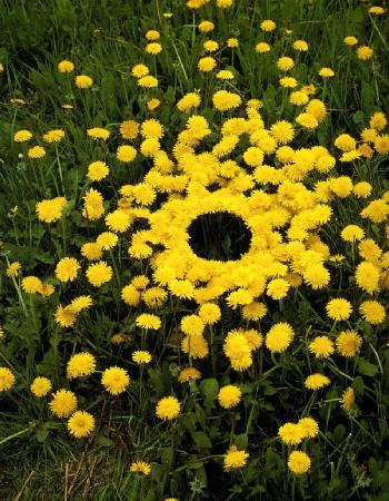
Focal Area
The center of interest, the placement of the most important conceptual and visual portion of the image. The focal area does not have to be located in the center of the image, as a matter of fact, placing it in off center to the left or right and either above or below the center line adds to the interest of the piece by giving the viewer introductory or supporting information.
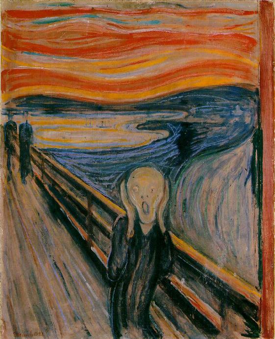
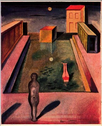
Edvard Munch - The Scream
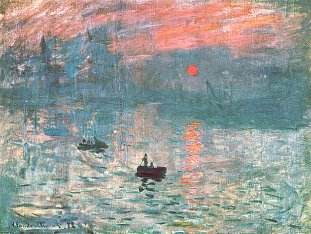
Claude Monet - Impressions: soleil levant [Impressions]
Andy Goldsworthy
The overall use of a color or color family used to set a tone, mood, as context. Color is usually the first thing we see. Don't confuse color domination with strong composition. The composition should work in grey scale or black and white and come to life when you add color. We all, except me, love a picture of a beautiful flower. We fall in love with the color. Show me a flower that has been powerfully composed and then we have something in which to sink our eyes, mind, and heart.

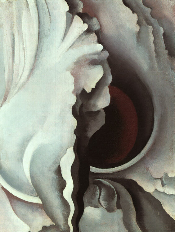
Georgia O'Keefee - Red Canna

Jean-Michel Basquiat - Election Day
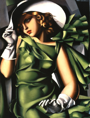
Tamara de Lempicka
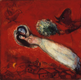
Marc Chagall
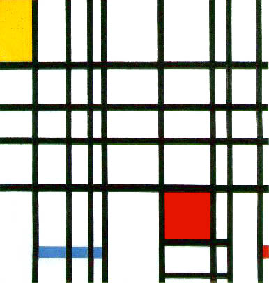
Piet Mondrian
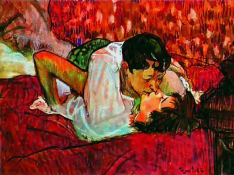
Henri de Toulouse-Lautrec - The Kiss
Strong light and dark value contrasts highlight the focal point. Value shows dimension. Value draws the viewer through the subtle undulations and gradual changes in surface angles. Value brings out the differences among a foreground that is in your face, a midground that may serve as the focal area or simply support, and a background that may be miles away. Value creates the illusion of form - depth, height, and width. Value brings objects off the surface.
Georgia O'Keefee
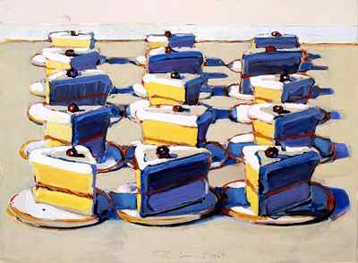
Wayne Thiebaud - Boston Creames
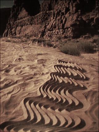
Andy Goldsworthy
Max Ernst - Aquis
Elements of different color, value, or shape direct the viewer's eyes to a focal point. The smallest butterfly moving across an other wise still background grabs our attention. Elements, almost regardless of size, that are irregular, that create the illusion of movement stand out. Go to a grocery store and look at all of the packages lined up shelf after shelf. Your eye goes to the brightest colors, but also to designs on an angle. It's called a mnemonic device. You could also call it visual movement.
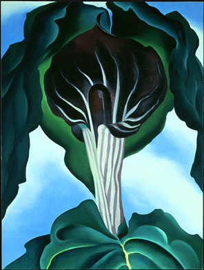
Georgia O'Keeffe
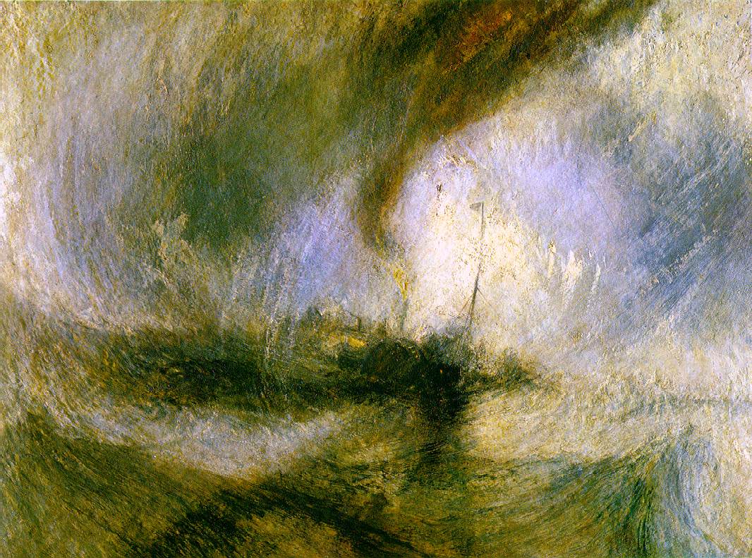
Joseph Mallord William Turner - Snowstorm
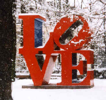
Robert Indiana - Love
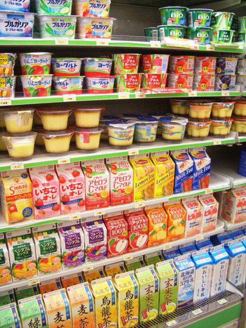
Japanese grocery store shelves
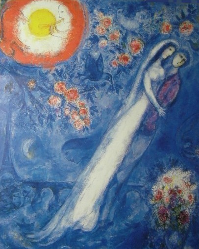
Marc Chagall

Georgia O'Keefee
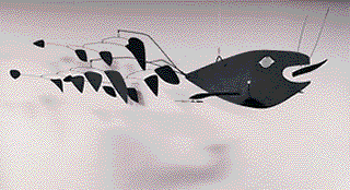
Alexander Calder
Emphasize an element that is different. You can use color, shape, line, texture, value, space, and or form in a way that distinguished one element or area from the whole to focus the viewer through the piece. Think about how we notice things that do not "fit in" to it's environment. When we see one dead tree in a healthy forest, it stands out from all the rest.
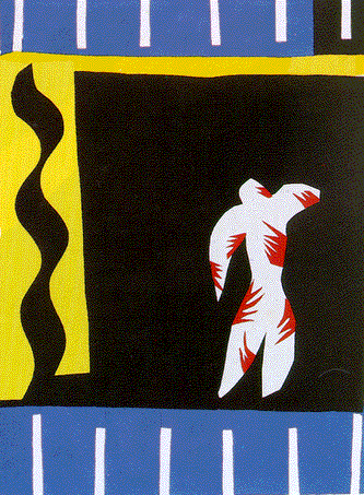
Henri Matisse
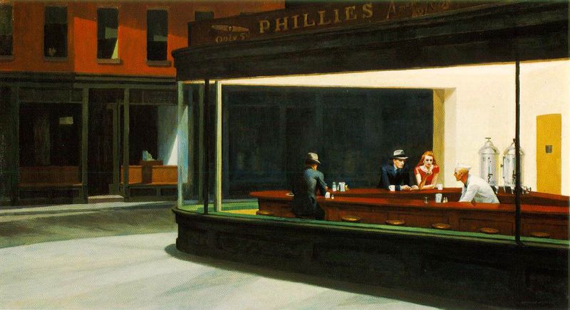
Edward Hooper - Nighthawks

Wassily Kandinsky
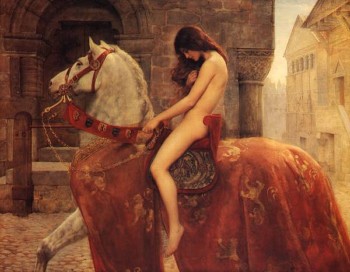
John Collier - Lady Godiva
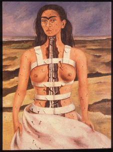
Frida Kahlo - Broken Column
Emphasize an element that has a different shape. Again, we are focusing on difference based primarily on shape.
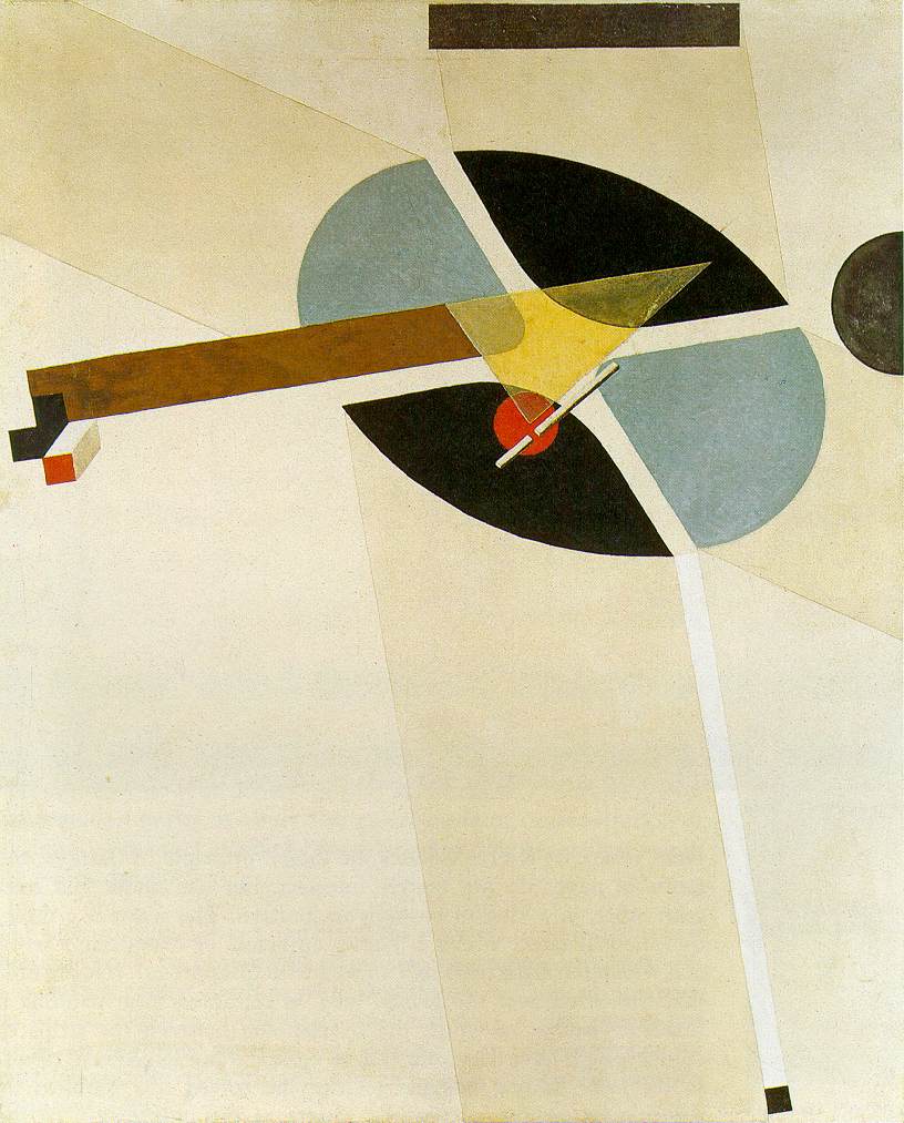
Eliezer Lissitzky - Proun G7
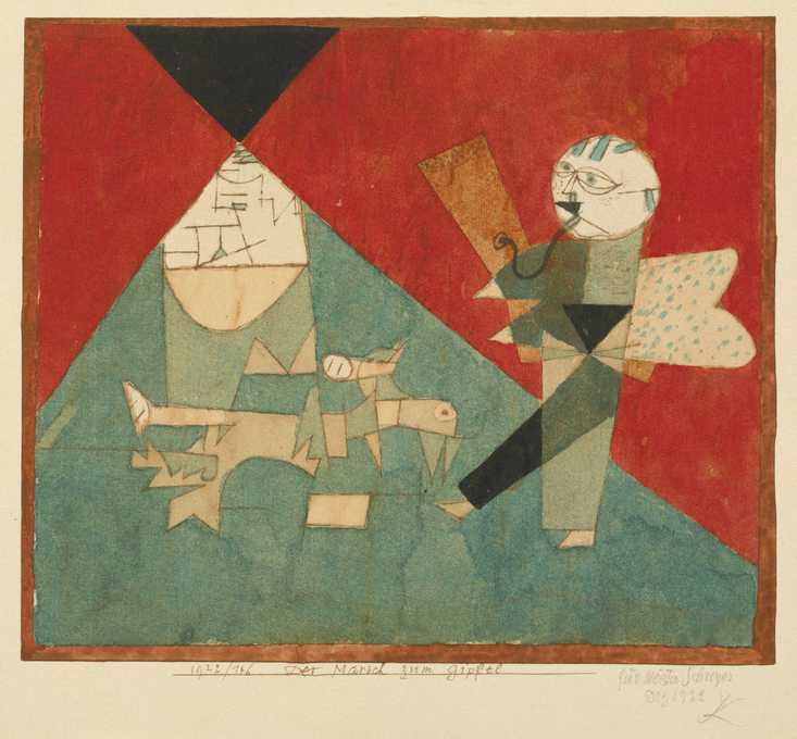
Paul Klee - March to the Summit
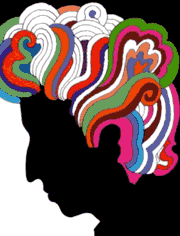
Milton Glaser - Bob Dylan
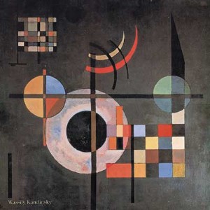
Wassily Kandinsky
|
|
Melissa and I would like to |