
 |
Art Elements of Art/Design Color
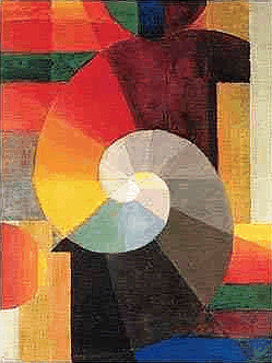
Johannes Itten: Die Begegnung, 1916 |
"I just wanted to send you a quick email on behalf of some of the children I volunteer with at the Family Nature Club here in Utah. We've been reviewing some resources on the Internet for our science projects and came across your page http://www.writedesignonline.com/resources/design/rules/color.html and found it extremely helpful! As a thank you, a couple of the kids wanted to send you back another page they found about eco-friendly wall painting that they thought you might want to add to your site because it could help you and your visitors as well http://www.moloneypainting.com/eco-friendly-painting-resource-guide/ They've actually been using it as much as your page to complete their project and thought it would be exciting to see it up on the same page as where they got the information from your site that helped them so much. I even offered Jenny, the student that presented it to me, extra credit if you wanted to help us! Would you be able to consider adding it for them? I would love to surprise them by showing them it on the site before they finish their project. They would be so excited!"
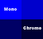
Monochromatic - One color. A monochromatic color scheme uses only one hue (color) and all values (shades or tints) of it for a unifying and harmonious effect.
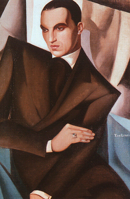
Tamara de Lempicka - Marquis Sommi - 1925 - http://cgfa.sunsite.dk/lempicka/p-lempick2.htm
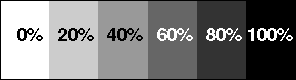
Value refers to the lightness and darkness of a color. For example, if light falls on a green ball the part of the ball nearest the light will be lightest in value because it reflects the most light. The part of the ball opposite the light will be the deepest in the shadow and thus darkest in value.
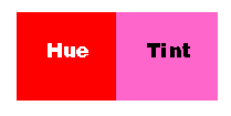
Remember - you can also change the value of a color by adding black (shade), or white (tint), or gray (tone). As white is added to a color it becomes "higher" in value (lighter). As black is added it becomes "lower" in value (darker).
Use values that are close together to give the design a calm appearance.
Use values of pure hues as well as those of tints and shades to create movement.
Use value contrasts to show texture and as an effective means of directing viewer attention in a composition.
Remember that value is the relationship of light to dark.

Katya - Katya 3 - 2002- Based on color theory of Josef
Albers
Neutral colors - contain equal parts of each of the three primary colors - black, white, gray, and sometimes brown are considered "neutral". When neutrals are added to a color only the value changes, however; if you try to make a color darker by adding a darker color to it the color (hue) changes.
Consider that black and white are thought of as neutrals because they do not change color.
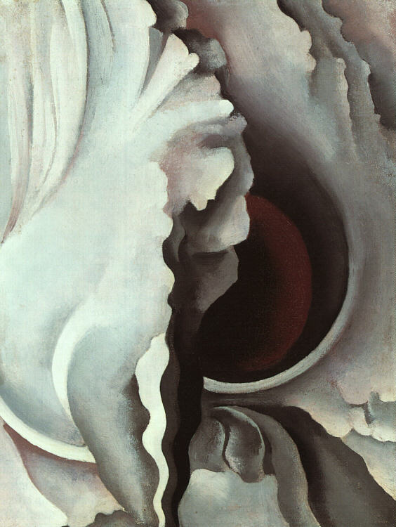
Georgia O'Keeffe - Black Iris III - 1926 - http://cgfa.sunsite.dk/okeeffe/
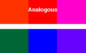
Analogous - colors that contain a common hue and are found next to each other on the color wheel, e.g., violet, red-violet, and red create a sense of harmony. Remember adjoining colors on the wheel are similar and tend to blend together. They are effective at showing depth.
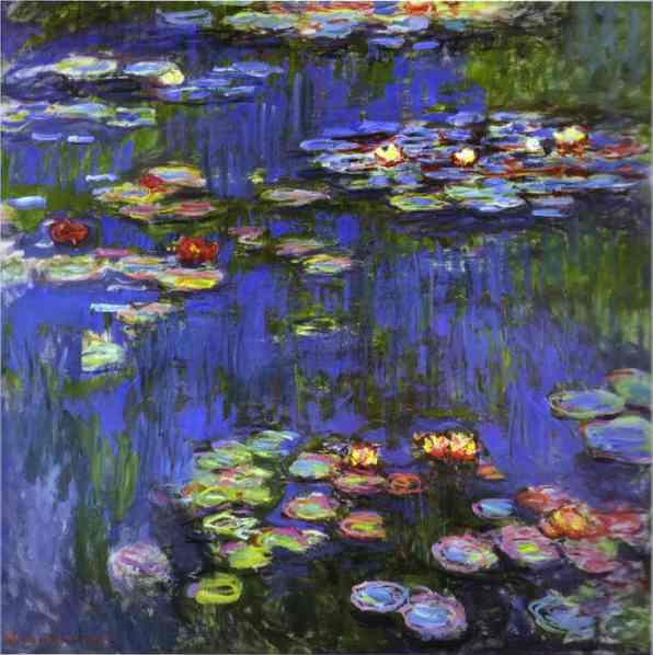
Claude Monet - Water-Lilies -1914 -
http://www.abcgallery.com/M/monet/monet146.html
Warm colors - suggest warmth and seem to move toward the viewer and appear closer, e.g., red and orange are the colors of fire.

Remember that warm colors appear larger than cool colors.
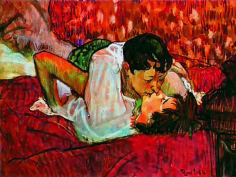
Henri de Toulouse-Lautrec - The Kiss - 1892 - http://tvm.tigtail.org/TVM/L_View/X2/c.PImpressionism/toulouse-lautrec/toulouse-lautrec.html
Cool colors - suggest coolness and seem to recede from a viewer and fall back, e.g., blue and green are the colors of water and trees).
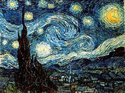
Vincent Van Gogh - Starry Night - 1889 - http://www.best.com/~martyw/Postimpression.html
Know that the color wheel is simply a guide on how colors relate to one another, it is by no means a formula for making successful art.
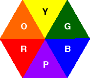
Complementary - two colors opposite one another on the color wheel, e.g., blue and orange, yellow and purple, red and green. When a pair of high intensity complements are placed side by side, they seem to vibrate and draw attention to the element Not all color schemes, based on complementary colors are loud and demanding -- if the hues are of low-intensity the contrast is not too harsh. Intensity can only be altered by mixing a color with its complement, which has the effect of visually neutralizing the color. Changing the values of the hues, adding black or white, will soften the effect.
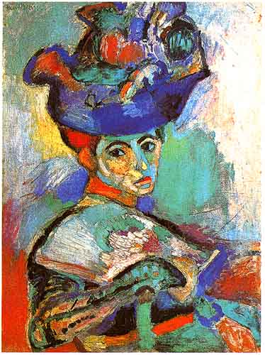
Henri Matisse - Woman with the Hat, Paris - 1904-5 - http://www.geocities.com/CapeCanaveral/2933/fauves/fvmatisse.htm
Intensity - brightness or dullness of a color. A pure hue is a high-intensity color. A dulled hue, a color mixed with its complement is called a low-intensity color.
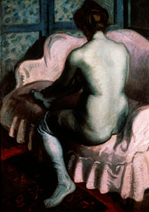
Raoul Dufy - Nude on a Pink Sofa -1902 - http://www.artlex.com/ArtLex/f/fauvism.html
Top
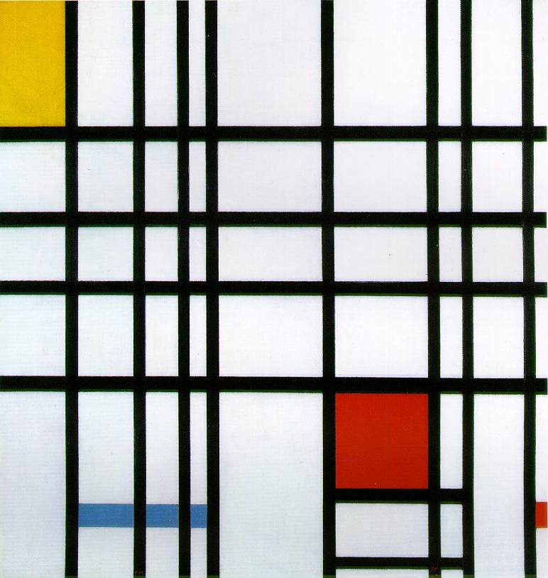
Piet Mondrian, Composition with Red, Yellow and Blue -1921
- http://www.ibiblio.org/wm/paint/auth/mondrian/
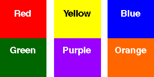
Secondary - by mixing two primary colors, you create a secondary color: Red + yellow =orange; yellow + blue = green; and blue + red = purple (violet)

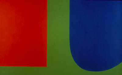
Ellsworth Kelly - Red Blue Green - 1963 - http://www.mcasd.org/exhibitions/permcol/artists/kelly.html
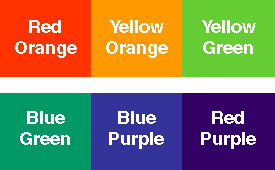
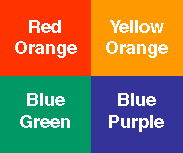
Intermediate - colors are created by mixing a primary and a secondary: Red-orange, yellow-orange, yellow-green, blue-green, blue-purple, and red-purple.
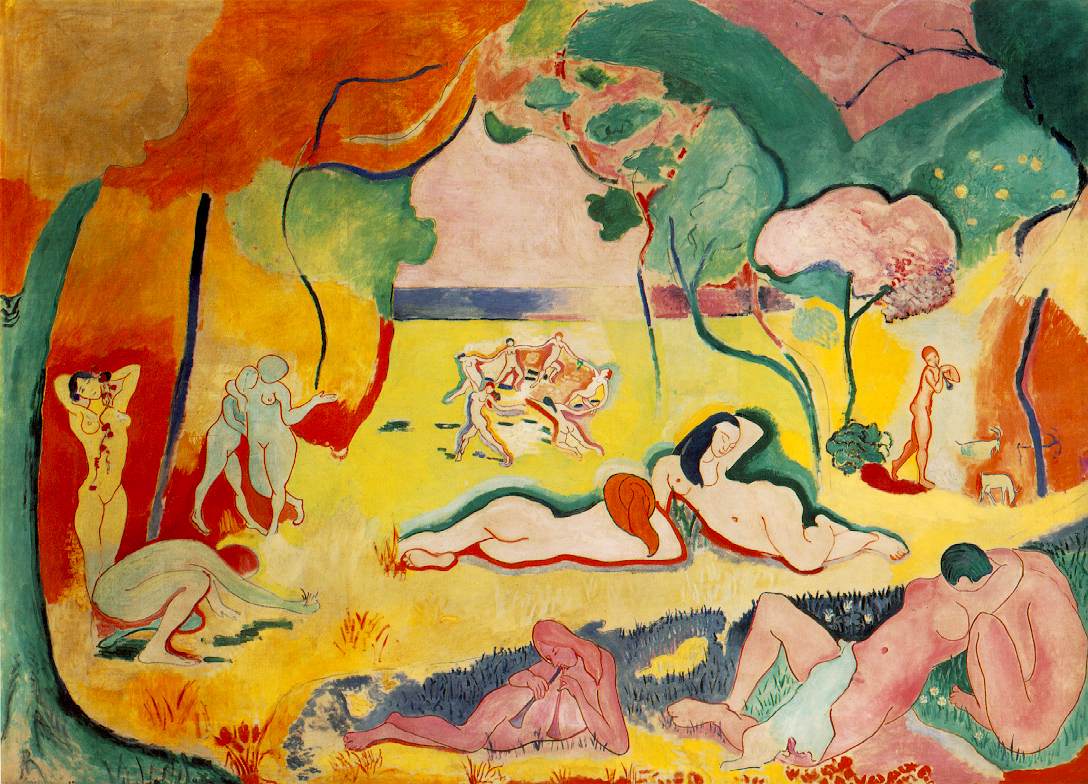
Henri Matisse - Le bonheur de vivre (The Joy of Life) -
1905-06 - http://www.oir.ucf.edu/wm/paint/auth/matisse/
Split complements - the combination of one hue plus the hues on each side of its complement. This is easier to work with than a straight complementary scheme. It offers more variety, e.g., red-orange, blue, and green.

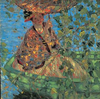
Frederick Carl Frieseke - Through the Vines - 1908 - http://www.sdmart.org/exhibition-frieseke.html
Double complementary - two adjacent hues and their opposites. it uses four colors arranged into two complementary color pairs. This scheme is hard to harmonize; if all four colors are used in equal amounts, the scheme may look unbalanced, so you should choose a color to be dominant or subdue the colors.

Claude Monet - Houses of Parliament, London, Sun Breaking Through
Fog -1904 - http://webpages.marshall.edu/~smith82/monet.html
Spatial effects - Such as, hues that are lighter at maximum saturation (yellows, oranges) appear larger than those that are darker at maximum saturation (e.g., blues and purples).
When a color expands visually, it may also seem closer to the viewer than those that seem to contract, leading to the common statement that warm colors appear closer and cool colors fall back.
Artists can bring any color forward or push it back, depending on what other spatial tricks they use. In addition, a large shape or form appears to be heavier than a small shape. Several small shapes or forms can balance on large one.
An object with a complicated contour is more interesting and appears to be heavier, than one with a simple contour. A small complex object can balance a large, simple object.
Remember that saturation is the relative brilliance or vibrancy of a color. The more saturated a color, the less black it contains.
Use highly saturated or high-intensity colors (a pure hue with no other colors mixed in) or busily detailed areas to draw attention and therefore give the appearance of carrying more weight than less saturated, low-intensity or visually simpler areas.
Balance and proportion - Generally speaking, highly saturated or busily detailed areas will draw attention and therefore seem to carry more weight than less saturated or visually simpler areas.
Balance - the two types of balance are formal (symmetrical) and informal (asymmetrical).
Proportion - the size relationship of one part to the whole and one part to another.
Emphasis - an area in a work of art that attracts the viewers attention first. The element noticed first is called dominant; the elements noticed later are called subordinate.
Unity - allows the viewer to see a combination of elements, principles, and media as a whole. Unity is created by harmony, simplicity, repetition, proximity, and continuation. For example, you could use the repetition of a color scheme to unify a composition. Another way to unify a composition is to simplify the color scheme by allowing one color to dominate the work. This is called tonality. Tonality does not have to be monochromatic, however, the overall effect appears to be of one color.
Movement - color can create a sense of movement. When the values in a work jump quickly from very high-key to very low-key, a feeling of excitement and movement is created. When all of the values are close together the work seems much calmer. When you want to create movement with color remember to use values of pure hues as well as those of tints and shades. Movement creates the illusion of action or physical change in position.
Rhythm - the use of repeated elements to create the illusion of movement. Visual rhythm is perceived through the eyes, and is created by repeated positive spaces separated by negative spaces. There are five types of rhythm: random, regular, alternating, flowing, and progressive.
Physiological effects - mystics have long held we emanate a colored glow, or aura, which is thought to effect the state of a person's health and spirituality. Today, chromotherapy is used to heal with colors. This form of treatment dates back thousands of years to the ancient "color halls" of Egypt, China, and India. A more prominent use of color therapy occurs in environmental design (the effect of color on health and behavior).
Color symbolism - our responses to color are not just biological. They are also influenced by color associations from our culture.
Personal color preferences - not only have we inherited cultural associations, but we also respond to colors in individual ways. Research has revealed some variables that help explain individual differences in color responses. One thing remains the same in color and that is our own color preferences are important to us.
Emotional effects - the actual emotional effect of a specific color in an artwork depends partly on its surroundings and partly on the ides expressed by the work as a whole. To be surrounded by blue lighting in an installation is quite different from seeing a small area of blue in a larger color context. For many of us the emotional effects of art may be difficult to articulate.
Local and expressive color - there are two opposite ways of using color in representational art. At one extreme is the local color - the color that something appears from nearby when viewed under average lighting conditions. We think of the local color of a banana as yellow, for example. At the other end of the extreme is the expressionistic use of color, whereby artists use color to express an emotional rather than a visual truth.
|
|
Any of various colors resembling the color of blood; the primary color at one extreme end of the visible spectrum, an effect of light with a wavelength between 610 and 780 nm. (Webster's, p.1614). Increases pulse rate and breathing and causes blood pressure to rise. Infants and children respond well to red. Red is for the amorous, outspoken, and optimistic. People who love red, love life. The food color. Ever notice that restaurants use red a lot? It makes you hungry by increasing your body's metabolism. Hot, passionate, urgent, danger, blood, devil, angry, enraged, amorous, outspoken, optimistic |
|
|
A color like that of egg yolk, ripe lemons, etc.; the primary color between green and orange in the visible spectrum, an effect of light with a wavelength between 570 and 590 nm. (Webster's, p.2201). The color of the sunny disposition, the idealist. Intellectuals love yellow. It takes more chemicals in the eye to see the color yellow. Yellow can have some negative effects -- babies cry more often and longer in yellow rooms; in convalescent homes it makes older people shake as it affects their minor motor movement. As you get older you tend to dislike yellow because it can make you feel anxious or angry. Yellow enhances concentration and speeds metabolism. Warm, cowardice, caution, fearful, bright |
|
|
The pure color of a clear sky; the primary color between green and violet in the visible spectrum, an effect of light with a wavelength between 450 and 500 nm. (Webster's, p.228). The number one color choice of the introspective and educated. Blue causes the brain to send off 11 chemical tranquilizers and is a wonderful calming color. or Pumps people up. Proven to increase energy. Weight lifters should lift in a blue room. Production people will produce more in a blue room. Not a good color for hospitals. Responsibility, trustworthiness, compassion, those are the attributes of royal blue. Honest, integrity, righteous, puritantical, moral, severe, prudish, cool, melancholy, sad, glum, downcast, gloomy, unhappy, quality, first place |
|
|
A color between yellow and red in the spectrum, an effect of light with a wavelength between 590 and 610 nm; reddish yellow. A secondary color that has been formed by the mixture of red and yellow pigments (Webster's, p.1361). Not a color that everyone loves, but those who do are generally social and fun loving. Confident, creative, adventurous, fun loving, sociable |
|
|
A color intermediate in the spectrum between yellow and blue, an effect of light with a wavelength between 500 and 570 nm.; found in nature as the color of most grasses and leaves while growing, of some fruits while ripening, and of the sea. A secondary color that has been formed by the mixture of blue and yellow pigments (Webster's, p.837). A good color for people in transition. Green is Mother Nature's color, lover's of green may be fickle. The money color--bound to influence. In Celtic myths the Green man was the God of fertility. Universal symbolism: Nature, freshness Contemporary symbolism: Ecologically beneficial Nature, health, regeneration, contentment, harmony,cheerful, lively, friendly, fresh, sickly, unripe, immature, simple, unsophisticated, gullible, new |
|
|
Any color having components of both red and blue, such as lavender, esp. one deep in tone (Webster's, p.1569). The color of fantasy. Most men dislike purple. Royalty, intelligence, wealth, beauty, inspiration, sophistication, high rank, exalted, imperial, princely, excessively ornate rhetoric, profane, shocking |
|
|
Of a color between white and black; having a neutral hue (Webster's, p.834). A good color for offices. It promotes productivity and stimulates creativity. Neutral, ambiguous, intermediate, apathetic, dull, drab, monotonous, mature, sober, somber, mousy, smoky |
|
|
Lacking hue and brightness; absorbing light without reflecting any of the rays composing it. The color at one extreme end of the scale of grays, opposite to white (Webster's, p.216). Produces a feeling of solidarity and formality. Black is a natural classic. The color of authority and power, yet also implies submission. Aloof, evil, death, unknown, fear, mystery, dark, night, sad, murky, sinful, inhuman, fiendish, devilish, infernal, monstrous, horrible, nefarious, treacherous, traitorous, villainous, depressing, somber, doleful, mournful, funereal, disastrous, calamitous, harmful, deliberate, pessimistic, dismal, hostile, threatening, wicked, disgrace, morbid, grotesque, undesirable, dangerous, false |
|
|
A color without hue at one extreme end of the scale of grays, opposite to black. A white surface reflects light of all hues completely and diffusely. Most so-called whites are very light grays: fresh snow, for example, reflects about 80 percent of the incident light, but to be strictly white, snow would have to reflect 100 percent of the incident light. It is the ultimate limit of a series of shades of any color (Webster's, p.2167). Never underestimate the power of this super neutral. It works with any other color, in any context, anywhere. One color plus white equals an almost foolproof color scheme. White would be an inappropriate color for a wedding in China. It is the color of mourning. If a bride chooses a white wedding gown, her parents would probably not allow her to get married. Innocence, purity, virginal, sterility, fairness, snow, frost, milk, ghostly, ultraconservative, blank, empty, transparent, honorable, dependable, auspicious, fortunate, harmless |
|
|
A color varying from light crimson to pale reddish purple (Webster's, p.1472). Makes one feel prosperous, a bit pampered. "Baker Miller" pink (deep shade of pink, similar to Pepto Bismol) is used in jail holding cells to calm prisoners. Pink is also used to treat patients suffering from headache disorders. Femininity, sweetness, prime, left-wing |
|
|
A dark tertiary color with a yellowish or reddish hue (Webster's, p.267). Solid, reliable brown is the color of earth and is abundant in nature. Light brown implies genuineness while dark brown is similar to wood or leather. Brown can also be sad and wistful. Men are more apt to say brown is one of their favorite colors. Earth, nature, dirt, tanned, drab, coffee, solid, sad |
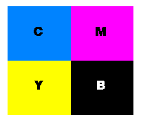
Remember that in printing, process colors: yellow, cyan (bright blue), magenta (blue red), and black make up all other colors.
If you select a color from a color swatch book and ask 1,000 printers to reproduce that color, you'll get 1,000 different colors.
The color of the paper affects the color of the ink.
Colors viewed on monitors, computer or television will vary significantly unless calibrated.
Consider that spot color results from adding a specific second color to the single color normally used (black is the traditional single color).
Use spot color to direct the reader's eye to special sections or important information for fast identification.
Screen one, or both, of your colors, and achieve the effect of printing in multiple colors. Screening is the process by which you use a percentage (or lower value) of a full color, creating a lighter shade of the original. You can also add black to the color to make it darker.
Add a single color to black-and-white photographs (creating a duo tone) to bring depth and richness to the document. Look for examples of different duo tones in design books.
Substitute a different color for black in a two-color job as an effective way to increase the appeal and richness of the document.
Be smart, a well designed piece with two-colors and screens (tints of the two colors) will always be less expensive and probably better looking than a piece designed with mediocre four-color images.
Know that if you are designing a four-color piece, it will probably require a five, six, or more run through the press. You will probably want a spot color (a special non-process color other than Cyan, Magenta, Yellow, and Black), a varnish (protective coating), and among other things a double hit (a second printing of a background color).
Create a chart to represent each of the items below. Use a one inch square for each set.
Analogous color scheme (colors that contain a common hue and are found next to each other on the color wheel
1 set in red, red-orange, and red-violet)

1 set in Tones (color plus 30% gray)

Complementary color scheme (two colors opposite one another on the color wheel)
1 set your choice

1 set in Tints (color plus white)

1 set in Shades (color plus black)

Seven Warm/Aggressive colors in a combination of pure color, tints, tones, and shades.

Seven Cool/Receding colors in a combination of pure color, tints, tones, and shades

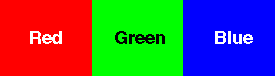
Triad color scheme (composed of three colors spaced an equal distance apart on the color wheel, e.g., the three primary colors - red, blue, and yellow.
1 set in pure color.

Diad color scheme (two colors that are two colors apart on the color wheel, e.g., red and orange.
1 set in Tints (color plus white)

1 set in Tones (color plus 30% gray)

1 set in Shades (color plus black)

Split complementary (one color and using the color on each side of its complement on the color wheel, e.g., red, yellow-green, and blue-green)
1 set in pure color.

Double complementary (two adjacent hues and their opposites, e.g., red and red-orange, green and blue-green)
1 set in Pure color.

Intensity (the brightness or dullness of a color. A pure color is a high-intensity color. A dulled hue (a color mixed with its complement is called a low-intensity color.)
Neutralize by choosing a high-intensity (bright) color and
neutralizing (dulling it) by adding:
Black, white, gray, and its complement
