
Symetrical-three-column grid
- Three-columns of text can speed up reading, but be careful
when sizing the text. Avoid rivers, big gaps between words,
usually when text is justified.
- Smaller column for captions or sidebars, and, or a smaller
column for white space, which gives breathing room to the
reader.
- The grid is divided both horizontally and vertically. This
allows symetry throughout the layout.
- Part of the layout should account for a header, a footer, and
a page number if required.
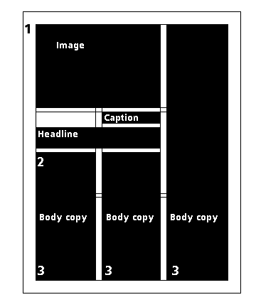
- Dead Area, a margin around the layout in which no live copy
should appear. Protects against printer errors and the loss of
important information. You can bleed art work into this area, as
long as it is extraneous imagery.
- Live Area, the portion of the layout which contains all
important information. Gives the reader a border for visual
relief.
- By breaking the layout into three-equal columns you have the
opportunity to use a combination of design configurations.
Site
Map | Rules
of Thumb | On-Line
Resources | Writing
| Glossary
| Quotes
| WordList
| Gallery
| Co-Teachers - Doug
and Melissa
E-Mail Doug at mrdoug@aznet.net
or Melissa at melissa_mckinstry@hotmail.com