Use graphic devices such as white space, rules, images, pull quotes, large initial caps, decorative caps, and dingbats (a decorative typographic character, not to be confused with Edith Bunker) to help the reader understand the content.
Maintain consistency in the use of ruling line thicknesses, fill patterns, and spatial relationship to text and other graphic elements.
Use a grid to help determine the size of images relative to other images (scale). Be consistent when images have the same importance within the piece, but enlarge or reduce if content dictates. Maintain consistency of page position, text-wrapping standoff, and border or frame, if any.
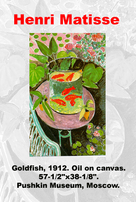
Remember that a picture is worth a thousand words, perhaps not, but a dynamic image that supports the copy certainly clarifies what you are trying to say.
Use graphic devices to direct the reader through the material.
Use graphic devices and images to breakup the layout so that the reader has opportunities to absorb information.
Add color images and graphic devices for more impact.
Keep the style of imagery consistent. It is alright to mix line art, photography, and painterly images, but make sure that the feel of each image complements the other images.
Find a balance between imagery and copy. Too many images can confuse the reader, but too few can leave the copy dry, or BORING.
Be careful that the images used can be reproduced without losing resolution.
Know the limitations of the medium you are using for the final presentation. For example many newspapers use 85 line screens for pictures causing a course dot pattern. Where as a fine magazine my use 150 line screen resulting in a fine dot pattern. Just know that the newspaper will lose subtly and shade while the magazine will show all of the nuances of the image.
Remember for Web reproduction, there are many variables. The transfer speed, platform, browser, and resolution of the monitor used dramatically varies the final outcome.
Don't use color images indiscriminately. The images should have power and punch or set a subtle tone. Either way, use color to support and strengthen the feel of the piece. If the tone of the piece doesn't need the color, lose it and go to black and white or a duotone.
Remember, color is too expensive to use unless it is truly adding to the image. The costs are not always financial. Often, the image loses quality and impact when not reproduced properly. In the case of the Web, transfer time can cause frustration and premature termination on the part of the viewer.
Don't forget that photographic images can be very problematic.
Remember that inexpensive photocopying will probably not do justice to the photo; although you can create some interesting effects.
Know that newspapers typically print at 85 line screen and have inconsistent ink coverage; meaning that subtlety and detail are often lost.
Consider that high-end printing is expensive. Pre-press operations such as scanning, photo manipulations, and final separations require lots of memory, time, and money.
Be aware that halftones, not necessarily photographs, but images with graduated or shaded images, can lose subtlety when using the wrong medium. Typically halftones are more effective when using higher-end reproduction tools.