
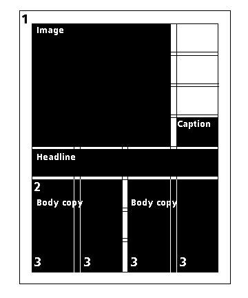
Symetrical-four-column grid
- Two columns of text improves readability by shortening line
lengths.
- The symetry of two columns puts the reader at ease.
- You may use alignment left, or justified text equally well,
depending on the intent of the message.
- One-colunm text layout &endash; Don't go across all four
columns, three-columns should be the limit for text columns.
- Headlines may go across all four columns in order to provide
balance.
- Smaller column for captions or sidebars, and, or a smaller
column for white space, which gives breathing room to the
reader.
- The grid is divided both horizontally and vertically. This
allows symetry throughout the layout.
- Part of the layout should account for a header, a footer, and
a page number if required.
- Dead Area, a margin around the layout in which no live copy
should appear. Protects against printer errors and the loss of
important information. You can bleed art work into this area, as
long as it is extraneous imagery.
- Live Area, the portion of the layout which contains all
important information. Gives the reader a border for visual
relief.
- By breaking the layout into four-equal columns you have the
opportunity to use a combination of design configurations.
Site
Map | Rules
of Thumb | On-Line
Resources | Writing
| Glossary
| Quotes
| WordList
| Gallery
| Co-Teachers - Doug
and Melissa
E-Mail Doug at mrdoug@aznet.net
or Melissa at melissa_mckinstry@hotmail.com