Grids define the most basic, yet most important parameters of your layout: page dimensions; live and dead areas; and column widths for images, headlines, body copy, captions, and other design elements.
Grids improve readability by allowing the designer to organize, align, and arrange elements in ways that give power and meaning to each.
"I saw
the angel in the marble and
carved until I set him free"
- Michelangelo, In Art
The following examples show some basic layouts using grids.
Asymetrical-five-column grid based on the golden section
Borders
Use borders when you want to frame and draw attention to information (e.g., table of contents, calendars, special notes).
Allow the edges of text columns and artwork to create the illusion of borders.
Draw attention to boxes or images by using borders with a drop shadow.
Directional Flow
Create directional flow with ruling lines and lines of type. Don't forget the lines within illustrations.
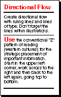
Use the conventional "Z" pattern of reading (western cultures) for the strategic placement of important information. Start in the upper left corner, work across to the right and then back to the left again, going top to bottom.
Focus
Draw the reader's attention to important elements by contrasting size (scale), color, and page position. Make sure the elements have a function that supports the content.
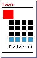
Use large, bold display type and/or graphics for the creation of focus. Use elements with visual weight, intensity, or color for focus.
General | Top
Remember: a brilliant project completed after the deadline may never see the light of day.
"If time be of all things the most precious;
wasting time must be, as Poor Richard says,
the greatest Prodigality Sin,
as he elsewhere tells us,
lost time is never found again"
- Benjamin Franklin
Don't let bad design hurt great content.
Be prepared to makes lots of revisions. Start with the big concept, and work through until you've eliminated all of the mistakes or else you've run out of time.
Don't forget that concept and content are everything.
Be consistent, help the reader recognize, identify, and comprehend different types of information.
Remember that design is evolutionary, turn mistakes and accidents into opportunities.
Don't be deluded, great design can help bad content, but only for a while.
Have someone who represents your audience review your materials.
Remember, "I like it.." is not a reason to include it in your design. Logic, clarity, and meaning should drive the design.
If you really want to be different, do it right.
Keep it simple.
Only include layout elements and copy that support the message.
Remember, the design is intended to help clarify and support the content.
Use graphic devices such as white space, rules, images, and layout to help the reader understand the content.
Use graphic devices to direct the reader through the material.
Page Organizers | Top
Use a grid to help organize elements on the page. Make sure that the grid is flexible, but that the grid sections are not too small. Divide the page into multiple columns (two, three, four, five or more) for increasing flexibility. I have used a seven column grid with very good success.
The margins are .375 inches and the gutters, spaces between columns, are .125 inches.
The smaller the text blocks the smaller the font size, e.g. for a two and a quarter inch column use 9 point type for best readability.
Use a single wider column with a smaller column for pullout quotes and other types of supporting content.
If printing, make sure to accommodate for three-hole punch, or other bindery techniques by adding a little extra white space to the inside margin.
Rules or Lines | Top
Place rules between headlines, subheads, pull-quotes, and other elements to separate content.
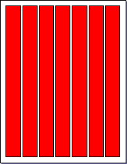
Separate columns with vertical rules. Be careful: they can interfere with content or misdirect the reader.
Use thicker rules at the bottom than at the top, but be consistent.
Show care when creating thick rules for printing because they can cause problems with ghosting (ink transfer to other parts of the document).
When printing, thick rules may not receive full ink coverage -- they may streak or lighten.
Provide ample white space around thick rules.
Include reverse type within thick rules, or bars. This draws attention to subheads or section breaks.
Screens | Top
Screen images or other elements for an effective, inexpensive way to add "color" to a page. Approximately 40% in printing costs may be saved by using two colors, screens, and reverses, over the cost of four-color printing.
Avoid using screens when limited separation is available between the copy and screened image. If an image must be placed behind text, make sure the type is bigger and bolder than normal and keep the screen at 10% to 20%. One should not have to fight to read the text.
Text Organizers | Top
Grab the reader's attention
with headlines
-- visually as well as in content.
Avoid headlines that create interest, but that do not support the real story.
Write short clever headlines of five to eight words for ideal results.
Use subheads to break the body of text into smaller, more understandable sections.
Use block quotes to separate long quotations -- four or more lines -- from the body text.
Use captions to clarify and give support to the image. Make sure the image supports and clarifies the content.
Use sidebars, related stories or blocks of information that stands off from the main body of text. They are a good way to add interest and help support the content.
Set captions, cutlines, and callouts in a manner that distinguishes them from body type by changing point size, weight, or leading. Italics are OK, but not on the Web.
When stories feed into multiple columns, set headlines to span all columns of a story.
Set bylines and continuation lines smaller than headlines, and with a style that distinguishes them from body text.
Set continuation heads above continued stories, and if stories are nested (run in multiple columns at different column depths), use a rule or box to span all columns.
White or Negative Space | Top
Leave plenty of white space around type and graphic elements (an eighth to a quarter inch depending on size relative to the layout).
Leave a little more white space at the bottom of a page relative to the top of the page (e.g., 0.75 inch at the top and 1 inch at the bottom). This will optically balance the page so it won't look like it is slipping off at the bottom.
Create a wide margin on the left side to direct the reader's attention into the copy or image area.
Use at least a quarter-inch gutter between columns.
Use left aligned (unjustified) text to create visual relief. Be careful that the "rag" indents on the right are not too big.
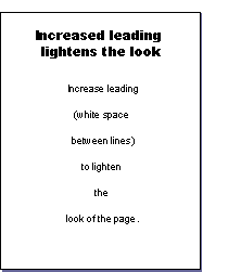
Increase leading (white space between lines) to lighten the look of the page.
Invite the reader into the page by leaving open space at the top and along the left margin.