 |
Art Drawing to Music |
Site Map | Color - Element of Art/Design | Balance - Principle of Art/Design | Andy Goldsworthy - Elements of Art/Design | Historical and Cultural Context | Quotes | Glossary | Graphic Organizers | Rules of Thumb | Co-Teachers - Doug and Melissa | Gallery
E-Mail Doug at mrdoug@aznet.net
Drawing to music exhilarates, relaxes, provokes thought, provides a meditative state, gives you a work out, challenges you to let go of your preconceived notions, and invites you to just respond to what you hear.
I love it.
You will benefit by not worrying about the product.
You can't make a mistake, well, not one that really matters.
Drawing to music is all about a process: Listening, responding, revising, editing, and finalizing - slightly removed from the design or creative process where you strive to meet a specific communication goal. Drawing to music is often times simply about interacting with the music, the media (I really like crayons, but almost any medium will work), your conscious and unconscious mind, and your body.
To start, get a work space that is comfortable. Depending on the size of the piece or how I feel, I prefer standing up to draw. It allows me to use my whole arm and body, a much more complete experience.
Next, get your media. As I wrote above, I really like crayons. Yes, crayons. It sounds juvenile, but you can start light, build layers by going darker, strip away layers with lighter colors to reveal new colors, and then go darker again. Give them a chance; you may find them really fun. If you have another favorite medium, go for it.
Select the material on which you would like to draw. Each surface, smooth, soft, textured, etc. influences the outcome. I like to draw in my sketchbook because the paper is sturdy enough to withstand the pressure of my strokes and the wax of the crayon goes on easily. I can also go back in to rework pieces, as well as recording my work in one place. If I'm feeling ambitious, I will use large sheets of paper. At the beginning, start small. As with every experience, there's a learning curve.
Once you have your media ready, choose something to listen to. It can be something you love or it can be something completely random. I prefer random. I like to choose a variety to music. By changing the mood, rhythm, and genre, you influence your drawing in ways that you can't imagine. I usually play individual tracks from different sources with almost radically different sounds. Where possible I use instrumental music because I am less influenced by the lyrics; although, it really doesn't matter.
Once you have the music queued up, wait a moment before you start drawing. Let the music guide you.
The following represent some rules of thumb to provide a little help in how to approach your composition. I try to create a piece that will fit into a circle, rectangle, or square. The frame, which may evolve and generally does, gives you boundaries. The boundaries are not restraints, but rather reference points to help you make decisions.
 |
 |
 |
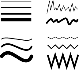
The first two decisions involve color and line.
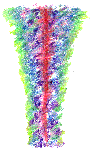
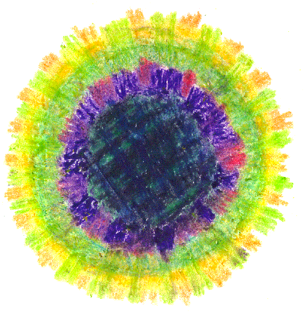
I try to limit my pallet to the basic color wheel.
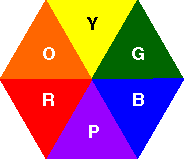
You can literally use only primary (yellow, red, blue) and secondary (orange, green, purple) colors. I will use some tertiary (yellow-orange, red-orange, red-purple, blue-purple, blue-green, and yellow-green) colors, but I have found that less is more.
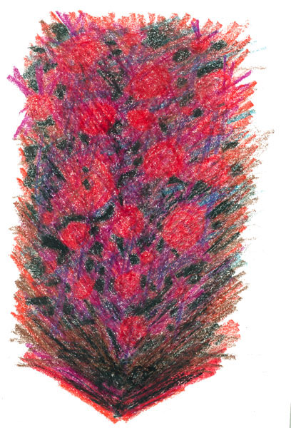
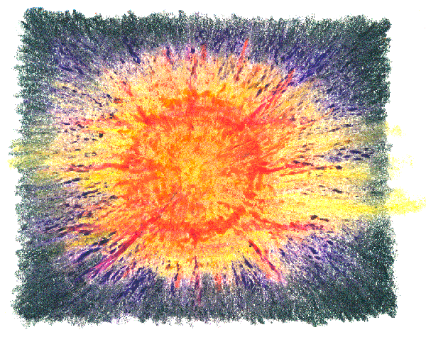
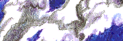
I select colors that reflect the mood of the music. Soft, light sounds usually evoke colors like yellows, oranges, and light reds. More intense sounds bring the feeling of darker colors like deep greens, blues, purples, and sometimes black. The music will direct you, but, again don't worry about making a mistake. Regardless of the colors your piece will evolve.
I always start with a light stroke so the color merely starts the process. By the end I have usually worked my way through the color wheel with the final result pushed to leave an overall emphasis on the mood.
 |
 |
 |
Once I select an initial color I immediately work on my line and shape vocabulary.
 |
 |
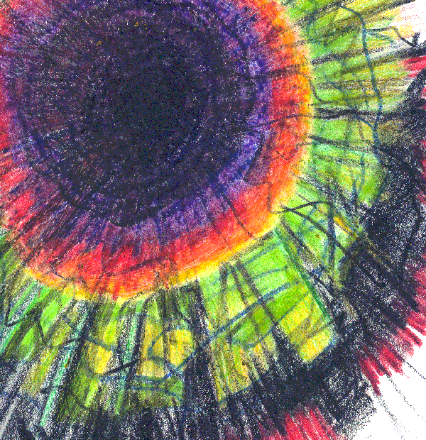
Lines reflect the mood. I will usually start with flowing and curved lines for soft and lyrical music. When the beat in more intense I use sharper angled lines. Again, the music is going to change and so will your strokes.
 |
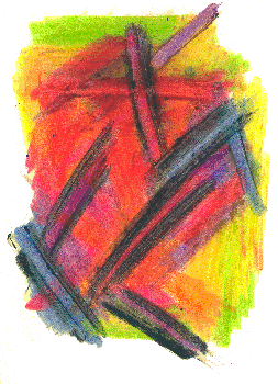 |
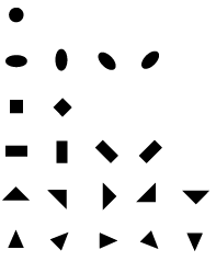
Shape vocabulary refers to how we use points, lines, and shapes to communicate. Just as we use words, shapes can tell a story or evoke emotion.
 |
 |
 |
Once you have the colors, lines, and shape vocabulary started, the fun really begins.
As I mentioned above, let the music direct you, but work the area within a frame. Don't worry about the size or shape of the frame, but use the frame to develop layers and your content. Create a composition - In his Notes of a Painter, Henri Matisse defined composition this way: "Composition is the art of arranging in a decorative manner the diverse elements at the painter's command to express his feelings." (http://painting.about.com/od/artglossaryc/g/defcomposition.htm)
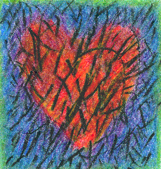
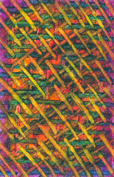
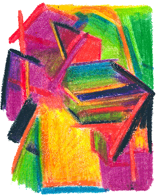
Often times my work is abstract or at least starts out abstract with no particular thought other than playing with the music.
Many times my work is inspired by a prompt, something we are talking about or something that has been on my mind. It may be abstract or representational.
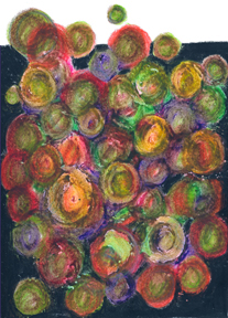
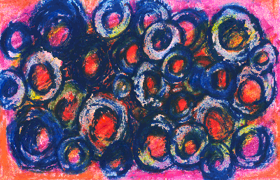
Bubbles of Love |
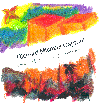
Honoring Richard Michael Caproni who died on 9-11-2001 |
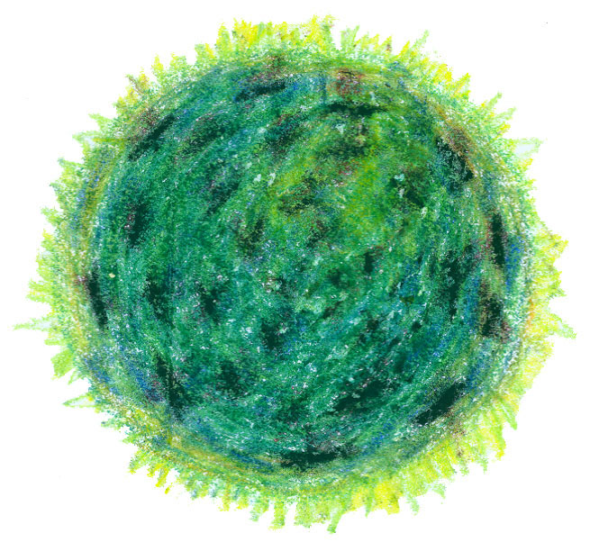
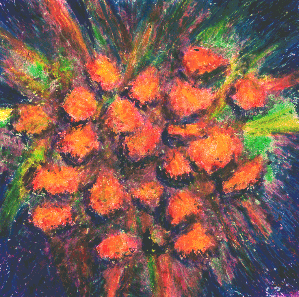
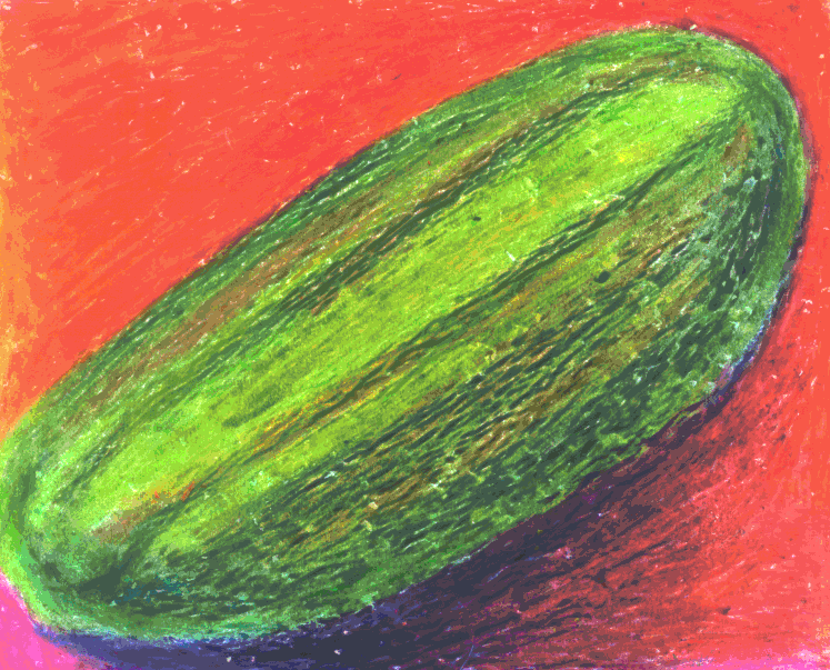
Sometimes the music, usually with lyrics, will lead me to a concept that may represent something. In the case below, a pickle. We were listening to Arlo Guthrie's, "The Motorcycle Song" - "I don't want a pickle. Just want to ride on my motorsickle."
I could go into the design rules of thumb and elements and principles of design, but learning that could take a life time.
Trust yourself and let the music guide you. Most importantly, enjoy the process.
|
|
Melissa and I would like to |