Site
Map | Quotes
| WordList
| Glossary
| Graphic
Organizers | Rules
of Thumb | On-Line
Resources | WriteDesign
| Co-Teachers - Doug
and Melissa
| Gallery
E-Mail Doug at mrdoug@aznet.net
or Melissa at mjmckinstry@earthlink.net
What distinguishes a great
artist
from a weak one is
first their sensibility and tenderness;
second, their imagination; and
third, their industry.
- John Ruskin
Integrity, the standard by which we live. In order to
show integrity in your work, certain design standards must be met.
Care and craftsmanship take time and effort. So does thinking. When
you take the time to ensure that your thoughts are presented clearly
and concisely, you show integrity.
We've talked about design; now we will show you what
we mean.
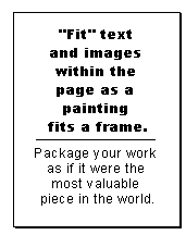
- Package your work as if it were the most
valuable piece in the world. Your work shows others what you think
and what you can do.
- Protect your work from stains, wrinkles, or
tears -- if you don't take your work seriously how can you expect
us to take it seriously?
- Cover all tape and glue -- no one should know
how you affixed elements -- nothing should distract the audience
from experiencing your work.
- Word process, at a minimum, all text.
Carefully-crafted calligraphy may also be used if
appropriate.
- Edit your work multiple times. Have others
provide feedback.
- Use the spellchecker.

Top
- Design your name into the composition. If your
name is required on the piece then it needs to be an integral part
of the composition, just as an image, text, or graphic element.
Also, never scribble/handwrite it in the corner when everything
else is computer-generated.
- Cut all edges crisply unless the design
concept dictates differently.
- Make sure all corners intended to be right
angles are 90 degrees.
- Align images and text vertically and
horizontally with precision, e.g., when the edges of two elements
should line up, then they should line up.
- Follow the rule of first read, second read,
third read which states: make the most important element(s) the
largest or most prominent, make the second most important
element(s) smaller and clearly less prominent, and so on.
NOTE: Most important means, what do you want your audience
to respond to first. Obviously you want them to see everything,
but what is the FIRST thing you want them to see? What is the
element that invites or compels them to continue?
Top
- Use "empty space" to create focus and
tension.
- Check for problems with "scale" - the size and
space relationship of one element to another, e.g., one element
may be too big or too small relative to the other elements. The
relative distance may also present a problem, e.g., too far away
or too close.
- Use images that support and clarify the
concept, e.g., if you are writing about the beach then your
image(s) should be of the beach. Symbolically represent the
attributes of the beach, and/or of the emotions felt at the beach.
- Use images and words carefully, e.g., if one
picture tells the story, use only one picture.
- "Fit" text and images within the page as a
painting fits a frame.
- Select a frame or border, when appropriate,
that complements the composition of the text and images.
Thickness, color, and pattern influence our perception. The frame
should not overpower or distract the audience from the
composition.
- See the WriteDesign
Rules of Thumb site for additional
ideas.
There are two men inside the artist,
the poet and the craftsman.
One is born a poet.
One becomes a craftsman...
- Emile Zola to Cézanne, 16 April,
1860
Site
Map | Quotes
| WordList
| Glossary
| Graphic
Organizers | Rules
of Thumb | On-Line
Resources | WriteDesign
| Co-Teachers - Doug
and Melissa
| Gallery
E-Mail Doug at mrdoug@aznet.net
or Melissa at mjmckinstry@earthlink.net
|

|
Melissa and I would like to
thank znet
for
making a commitment to
education and WriteDesign.
|